It's a Process - 2010 Site Design
I was digging through my old sketch books looking for shitty drawings to post (they will be coming) when I ran across my initial design sketches for this site's current design. Seeing as I plan on rolling out the new site within the next few days, I thought it'd be more timely to post those instead.
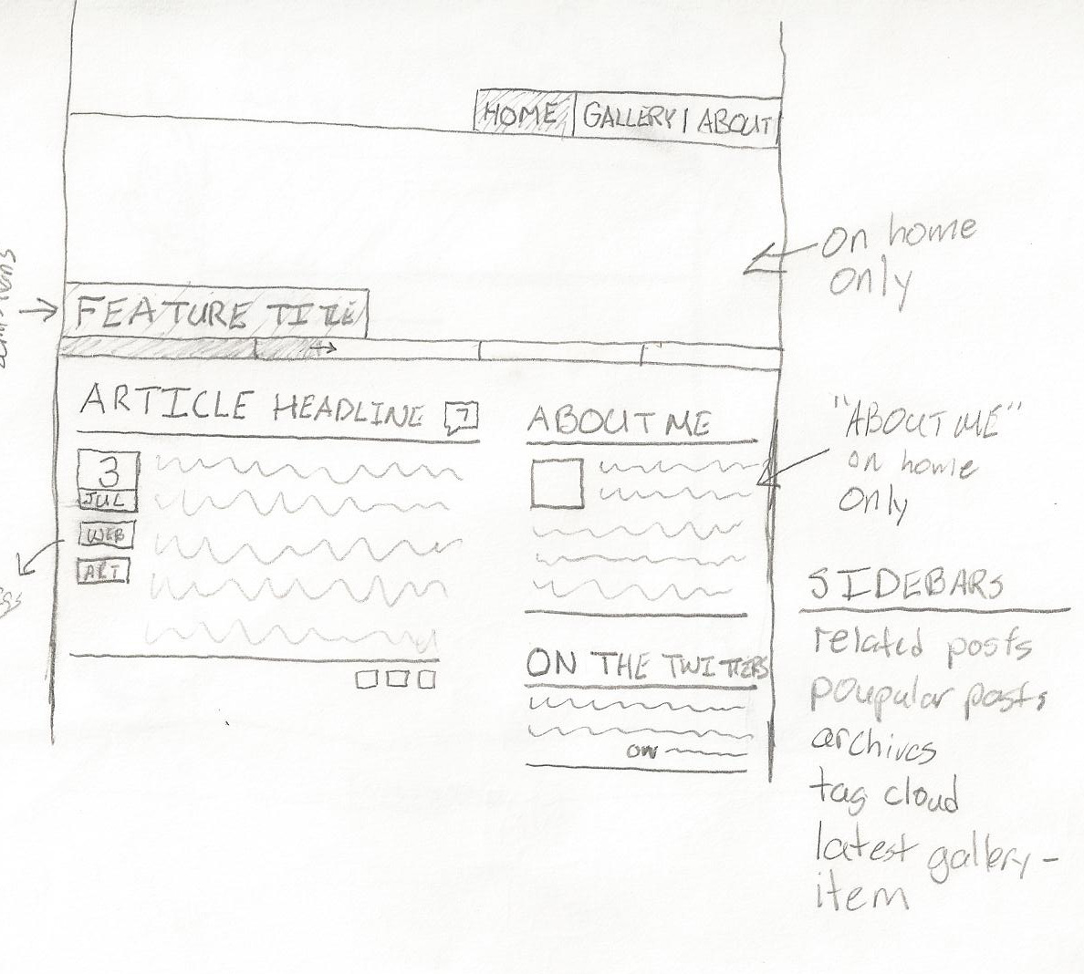 An overview of the basic site layout. As you can see, there's not much difference between this sketch and the final product. Somewhere along the line the "about me" box was lost, but the rest is nigh spot on.
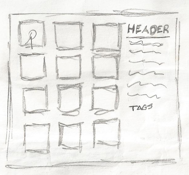 This doesn't have any accompanying notes, but I assume that it must be a concept for the gallery pages (they're the only ones with the square grid).
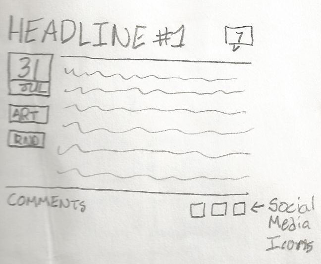 A more detailed version of a blog entry. The social media icons were eventually dropped and the comments counter moved to the bottom. Couldn't rip everything off of Joystiq...
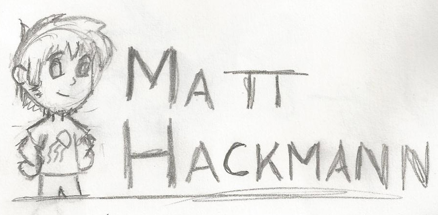 I fought for the longest time with what the site header should be. I'm wondering why I dropped the caricature of myself sporting my signature jellyfish t-shirt.
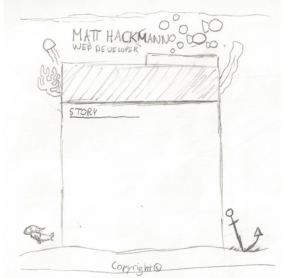 An idea for a full site theme. Post launch I added the circles to try and curb the gratuitous white space.
Arguably, my designs don't go through a whole lot of iteration on paper; they spend most of their time being refined in my head and again in code. This is not the best way to approach design, but designer is a title I'm trying to leave behind, so I suppose it's okay.
