The De-evolution of Nintendo Box Asses
It can be argued that Nintendo has somewhat ripped off Apple when it comes to design and asthetics. Everything is very simple and clean almost to the point of being sterile (as in the hospital, not the inability to bear children). However, one disturbing trend seems to be their boxes. Not the fronts, mind you, but rather the backs. Join me as I go through a box design from every generation of Nintendo console (save N64) and grade them on design.
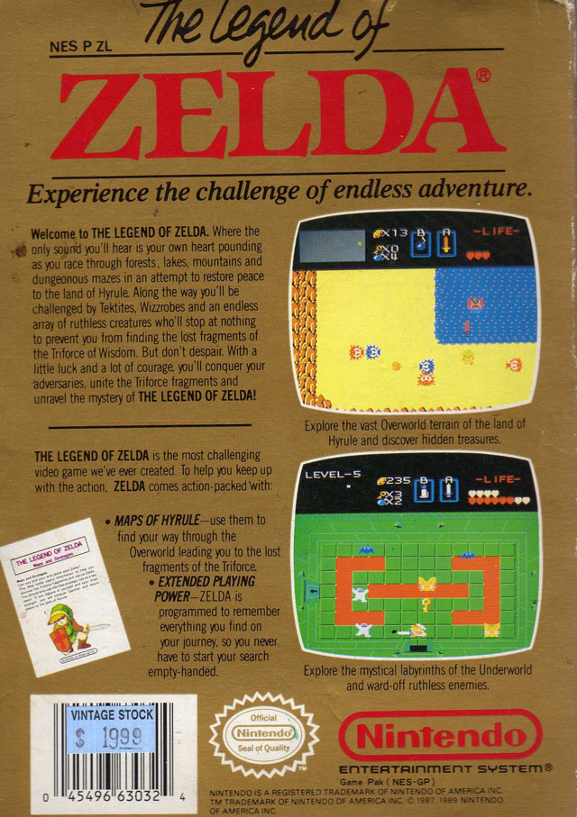
Legend of Zelda (NES)

Now, being of thick German heritage I'm going to allow the Nazi in me to speak for a second. The first two sentences in that first paragraph should be rolled together with a comma seperating them, not two sentences. But enough about that, more about the design. They've used their space wisely on this one. There's plenty of informative text on the left and some snazzy screenshots of Link kicking ass on the right. The text placement on the left bugs me a little, especially with that strategy guide picture throwing off the alignment of the text to the right. I also think they could've used a font that wasn't so narrow as it makes things seem a little crowded. The UPC and logos on the bottom are nonintrusive to the other elements on the box. The logo (or lack thereof) kind of bothers me, but being the first game in the franchise I'll go easy. On the whole, this box conveys its message in a manner that's pretty easy to read and for that I give Legend of Zelda a B.
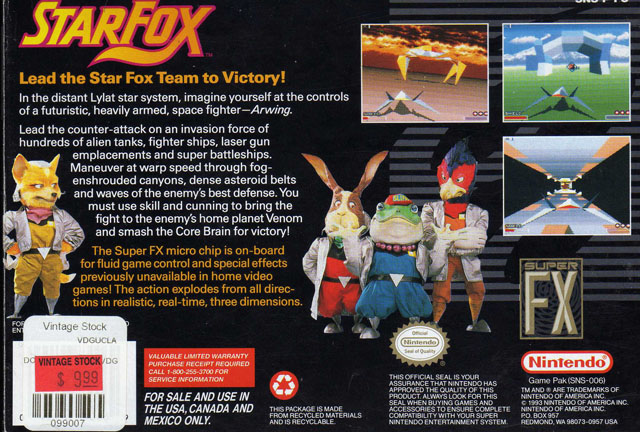
Star Fox (SNES)

In my opinion, the best design of all the box arts I will review. The logo up in the corner is super kick ass and plays off the title nicely. The text directly below is rediculously crisp and easy to read and the changup in color is a nice way to guide your eye to where they want. The pictures of the Fox team are well placed (and pretty awesome, too) and fit the theme pretty nicely. Of curse, there are the screenshots balancing out the upper left and advertising the 3D amazingness of the Super FX chip whose logo is below. The logos at the bottom are still pretty reserved, though they kind of do creep up into the main part of the box. I also think the Super FX logo should have been down there or placed closer to the block of text advertising it. However, this is an awesome box design, easy to read and kick ass looking to boot. I give Star Fox an A.
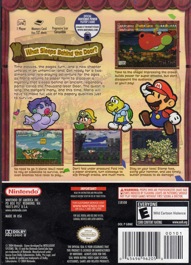
Paper Mario: Thousand Year Door (GCN)

Here's where things begin to go south. First of all, the "requirements" is throwing off the flow of design. It is far too tall for being up at the top. I understand the utilitarian-ness of it, but taking up that much room? How about you move it down to the bottom and once you've sold the game and person wants to know this, then they'll see it. The main text on this, whilst not illegible, is very close to bordering on it. The color is very similiar to that of the background (hence the white border), but their choice of font wasn't helping either. You should rarely or never use a stylistic font such as this for blocks of text. It works well for the "What Sleeps Behind the Door?" banner, but not very well for everything else especially when they get the text really small underneath the screenshots. And while we're talking about the screen shots, these are actually okay for the most part, at least the ones on the bottom. Then there's the random screenshot up at the top right that was probably thrown in as a space filler because of the crap that sits to its left. The Mario characters filling in the vertical gaps between the top and the screenshots is decent, though their placement seems slightly uninspired. And, what's the the random confetti bits? There's so few of them that it seems out of place. Finally, the logos and stuff at the bottom are now taking up a third of the entire box. Why the hell do you need to shove down my throat so much that playing your game will give me seizures? Not only do you tell me on this box, but you also include a booklet about it and the first screen of the game tells me! My final verdict on this one is a C, kind of nice looking but bordering on difficult to read.
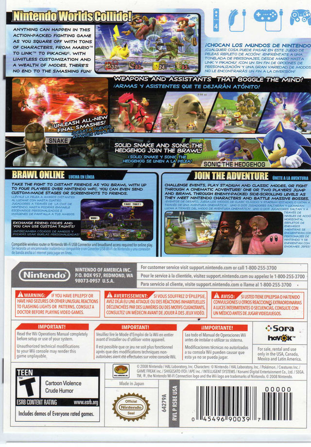
Super Smash Bros. Brawl
 And, here we are. The uber clean Wii generation. Oh? What's this? This box looks more like the back of a Microsoft product instead of the cleanly designed crap from Cupertino. I really don't even know where to begin on this one. I suppose I'll start by saying all the text is microscopic and it's even worse if you are a border jumper and have to read the ranslations. Which makes me ask: why so many damned translations? Last I knew America was a predominately English spaking country and I'm pretty sure this game is also in English. And, dear God, why is all the text in comic sans? It would be hard enough to read in a nice, clean sans-serif font, but this is unacceptable. With all that extra text they've had to stick in crappy ass "screenshots" and I put that in quotes because most of them look like freeze frames from the first E3 trailer. There are two real screenshots: the one at the top and the teeny, tiny one in the online play box. All this stuff seems to just have been vomitted on the canvas with very little rhyme or reason and it's extremely difficult to read. And, finally, the part that pisses me off the most. If you'd paid attention to the last three boxes you'd have noticed that there was an alarming trend where the logos, barcodes, warnings, etc. gradually took up more of the box. Well, on Smash Bros Brawl they went whole hog and now it occupies HALF THE FUCKING BOX! With all those red warning labels, I feel more like I'm reading the back of a bottle of cyanide pills than a game box. And, of course, it's in fifty thousand different languages. WHAT THE FUCK?! I WANT TO GET SEIZURES, POR FAVOR! How about you throw in a robot that tells you that you'll get seizures whilst raping your ass with a spiked dildo?! You're already raping our eyes, how can it get worse?! The only real good thing that can be said about this one is that the possible controllers seems more out of the way, but it's of little use as they cram more stuff in than a drunk Paris Hilton. My final rating: F
Well, Nintendo, you keep on making all your stuff seem "clean" and "inviting". We all know the truth and that truth is hiding on the back of each and every game box that is sitting on store shelves with your name on it.
