Useless Justification
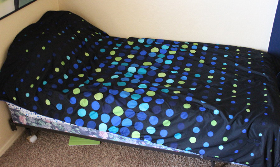
One of the things that seems to come up with some frequency at work is the size of my bed. I don't know how or why, but there it is.
Anyways, I sleep in a twin bed and one of my coworkers can't quite comprehend how I can sleep in a bed so small. My general response is it takes up less space and I'm the only one sleeping in it (also, it's fucking comfortable). I also have a reverse claustrophobia when it comes to beds: the larger they are, the more uncomfortable I am. But, today as I was lying comfortable in said bed, I realized that there is a more objective way to prove my twin bed is more awesome than all other beds: it's widescreen.
We all know that widescreen is the preferred video format of choice these days as it closer matches the aspect ratio of our own vision; we can see a wider field of view than we can in height. Here's some aspect ratios of common video formats:
Anamorphic widescreen (film) - 2.39:1 HDTV, aka 16:9 - 1.78:1 SDTV, aka 4:3 - 1.33:1
These are width to height ratios, so let's take that and apply them to standard bed sizes:
Twin - 1.92:1 Full - 1.38:1 Queen - 1.33:1
As you can see, twin falls right in between film and HDTV, which is a particularly awesome place to be. However, the larger beds are all standard definition (with queen size being right on the money). We all know how much standard definition sucks.
Now, if you'll excuse me, I'll be on my modern day standards sized bed.

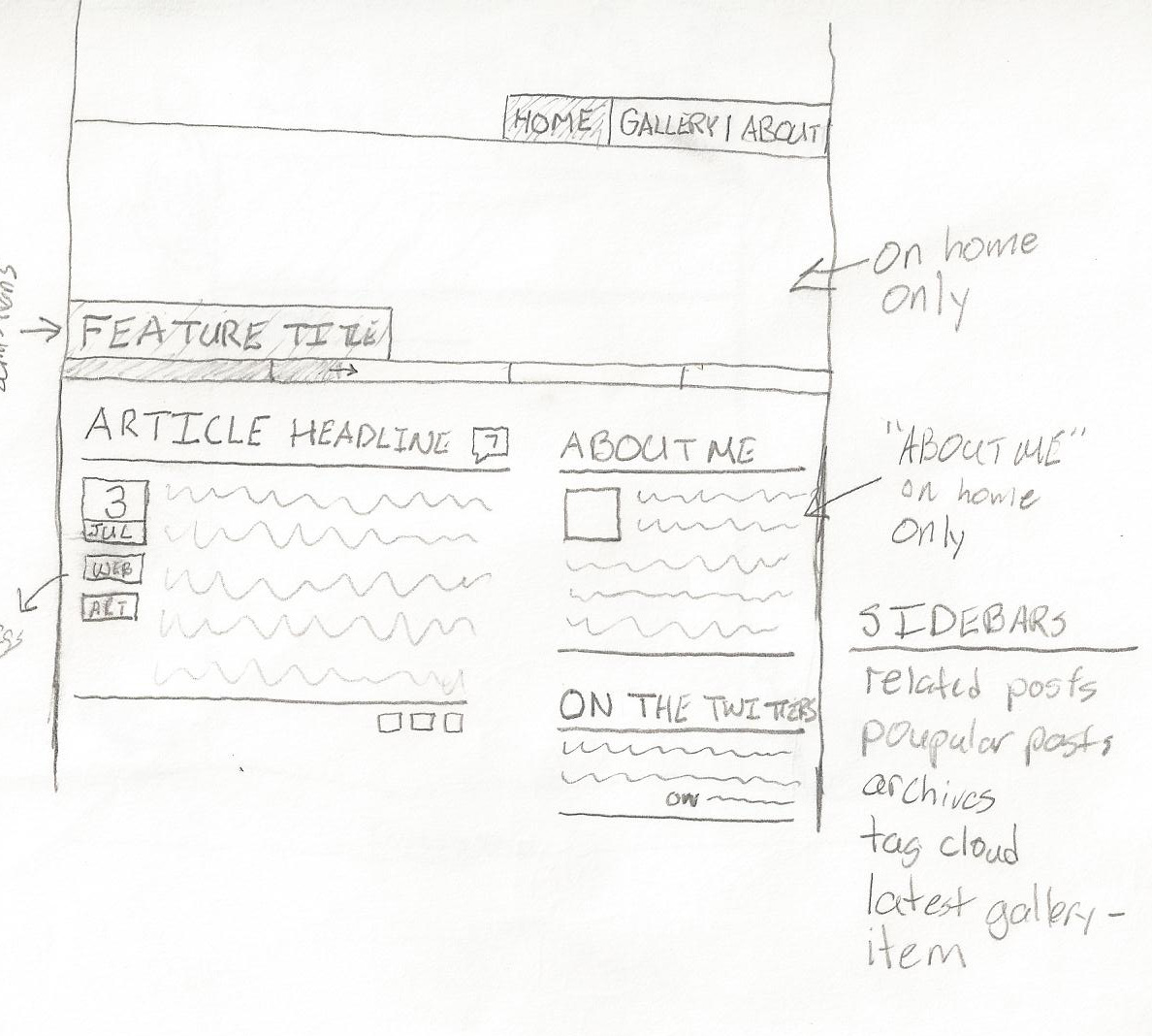 An overview of the basic site layout. As you can see, there's not much difference between this sketch and the final product. Somewhere along the line the "about me" box was lost, but the rest is nigh spot on.
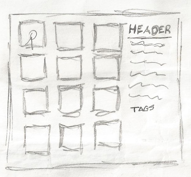 This doesn't have any accompanying notes, but I assume that it must be a concept for the gallery pages (they're the only ones with the square grid).
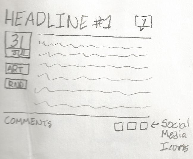 A more detailed version of a blog entry. The social media icons were eventually dropped and the comments counter moved to the bottom. Couldn't rip everything off of Joystiq...
 I fought for the longest time with what the site header should be. I'm wondering why I dropped the caricature of myself sporting my signature jellyfish t-shirt.
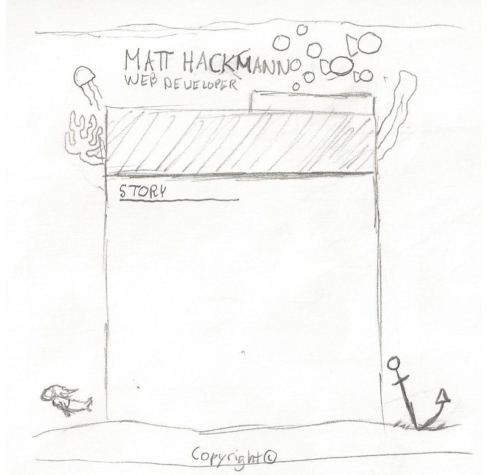 An idea for a full site theme. Post launch I added the circles to try and curb the gratuitous white space.
 These are the contents of two grab bags I picked up. Nothing terribly interesting, I suppose. And the j-rap CD is just as bad as the cover might lead one to think.
 This show is pretty hilarious and not very popular (that I know of), so I was surprised to see this at all.
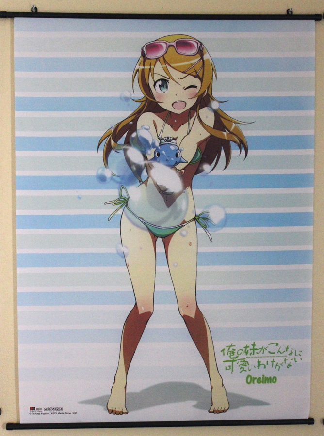 And this is the purchase that has me seriously questioning my life. As I was unfurling it, I began to realize that I had just doomed myself to a life of perpetual virginity. Either that or I'm going to have to find a very forgiving girlfriend.